Hello readers! Today’s blog post is mostly waffle with some updates. I’m very busy readying the second book in the Highmoor series for publication, so you can expect an announcement on that soon. I’m also very slowly creating a map to go with each book, and this has been a lot more time-consuming than I anticipated. As such, I thought I’d use this blog post to wax lyrical about maps and map-making, for both real and imaginary worlds.
Why do we make maps?
This might seem like a silly question with an obvious answer, but I think it’s still worth asking. Maps show us where things are, helping us to communicate the locations of resources, territories or hazards, and enabling us to find routes or draw borders. Maps can also help us understand our environment, as they allow us to identify patterns in landscapes.
However, as with any form of communication, there is an art to conveying information using maps. Each one is different, designed for a specific task, which will determine the scale and level of detail. For example, if you wanted to hike up a mountain, you wouldn’t take your road atlas with you (the one which has been festering in the back pouch of the driver’s seat for twenty years). Instead, you would take an OS Map, or – if you possess an alarmingly unshakeable trust in technology – your smartphone.
Given that every map is trying to achieve something different, it becomes quite difficult to define what a map is. You’ll usually know one when you see one. We expect a top-down view of something, simplified to emphasize the key elements of interest, often with an intuitive colour scheme and succinct symbols. However, there are grey areas in our definition. Is a satellite image a map? Not really – although it can be used as one. Is a cross-section through a building a map? Sort of – and it certainly makes it easier to navigate vertical pathways like lifts and staircases. Is a miniaturised 3D reconstruction a map? Again, not really, although these are often more engaging for visualisation. What about landscapes drawn at a high angle? These are limited by having features hidden behind others, but this can help with conveying heights. Finally, is the so-called “Tube Map” really a map, given that it is a schematic diagram with tenuous links to the physical world? Who knows.
Early maps
There is a lot of debate around what constitutes the oldest map in existence. This is partly because of the difficulty in defining what a map actually is, and partly because we can’t be entirely sure whether some scratches on a rock represent carefully-scaled topography, or the scars of a particularly chaotic fight between a caveman and a wall.
Now that we’re so familiar with maps in the modern era, it is easy to look back and assume that our ancestors would have wanted to create maps too. However, there is a good chance that the concept was unthinkable to them, just as satellite navigation would have been unthinkable to the Vikings. One of the oldest examples of a potential map is in the ancient city of Çatalhöyük, which is 7500-5700 years old. To modern eyes, it certainly looks like a map, showing rows of houses and an erupting volcano in the background (see this article). However, some academics have urged caution. Although the little rectangles closely resemble the box-like houses, and although there is an active volcano nearby, this may just be a pretty pattern. One academic is convinced that it depicts a leopard skin – not a map.
Wikipedia suggests that the oldest map is carved on a mammoth tusk found in the Czech Republic, dated to 25,000 BC. However, it takes some powerful magic-eye techniques to see this. More convincing maps were produced by the ancient Babylonians and Egyptians, and the ancient Greeks made some of the first world maps (or at least, the Mediterranean and northern Africa). The accuracy on these is impressive, considering the limitations of the time – but with no way for them to check their work, you have to wonder how reliable they thought they were.
Modern maps
With improvements in mathematics and astronomy came improvements in mapping. One of the most innovative projects was the Cassini Map of France, initially commissioned by King Louis XIV to get a better idea of how much land he owned. The project was so big that it took over sixty years for four generations of Cassinis to complete. Their triangulation was so accurate that their mapped roads line up well with satellite images from today, making it a fantastic achievement for the Cassinis (and all the unnamed peasants who helped them).
Of course, mapping really took off once we gained the ability to take photographs from the air. Most modern maps are drawn based on satellite images, using specialised software, with topography from radar surveys. The use of drones in scientific research is going to revolutionize mapping at local scales thanks to structure-from-motion technology, where 3D models can be built from multiple photographs. In short, mapping is very much a developing field.
Honourable mention:
William Smith’s geological map of Britain! In 1815, one man decided to map the geology of an entire nation. Nobody had done this before – probably because it takes a certain type of person to understand the allure of cool rocks, to want to collect them all, and to want to make a painfully detailed map in order to help other like-minded rock connoisseurs.
William Smith’s map detailed large-scale rock units, separated based on the fossils he found within them. He coloured them in beautifully (all within the lines) and even added cross-sections to show what was going on beneath the surface. Truly remarkable for the time. A little bit lacking when it came to anything igneous or metamorphic, or anything outside England, but he was only one man. It was a valiant effort, and a revolutionary map (see it here).
Fantasy maps!
Let’s get back to what started this rambling blog post: making maps of non-existent places. A fantasy novel almost feels incomplete without a map to accompany it (and yes, apologies – mine will be finished at some point). The map serves two purposes: firstly, to be a work of art, and secondly, to help the reader understand where things are. A map often brings the world to life, because the plot probably won’t visit every square inch of the land, and you don’t want to leave the reader feeling as if the characters and story exist in a narrow corridor within an empty void. You want to give the impression that the world is fleshed-out and fully realised (it is, trust me – and it’s taking forever to draw) rather than a vague strip of grass and trees.
We have one man to thank for the prevalence of fantasy maps: J. R. R. Tolkien. His maps of Middle Earth are beautiful, and recognisable even to people who haven’t read his books. Tolkien pretty much invented the modern fantasy genre (or, at the very least, popularised and normalised it), and his inclusion of maps made them a staple for any fantasy works that followed. Nowadays, if you try publishing a fantasy novel without a map, it isn’t long before people are asking for one (please, I promise it will arrive one day).
Part of the draw of fantasy maps is that they can be digested more quickly than any storyline associated with them. They lend themselves to being hung on walls and displayed as desktop backgrounds, and they can be much more powerful than a blurb or book cover when it comes to catching the attention of new readers. In fact, due to their accessibility, maps are something of a gateway into the fantasy genre. A child probably won’t have the attention span to write a novel, but they might well sink an afternoon into inventing a world where one could take place – and this is a slippery slope. Give them twenty years and they’ll be churning out books or orchestrating sprawling D&D campaigns.
What do we look for in fantasy maps?
There are various attributes that make a good map, but these aren’t necessarily the same ones that make a good fantasy map. How do mapping techniques translate to something that doesn’t exist? Style is very important, but a fantasy map should still show us the layout of the land, so we can appreciate the distances involved when characters travel between places. We won’t ever need it as an actual navigational aid, so it doesn’t need to be super-detailed, but it also shouldn’t be over-simplified. For example, a fantasy Tube Map wouldn’t be much use, because the relative positions of places matters (although, unsurprisingly, people have made Tube Maps of Middle Earth). Usually, fantasy maps have a medium level of detail – coastlines, rivers, mountain ranges, etc. – and follow real-world mapping rules.
However, when we look at Tolkien’s maps, they contain some rather un-map-like features. The mountains are drawn with perspective, as if we are viewing them slightly from the side. This means that the north faces of Tolkien’s mountains are always out of sight, and they presumably hide any smaller peaks that lie behind them. The pointed summits aren’t just part of a stylistic symbology: notable, named peaks are drawn deliberately taller, and mountain passes are drawn through the gaps. There is no question that the result is visually appealing, but on a real map, this style would be a nightmare for navigation.
Realism in fantasy maps
Another point worth making about the maps of Middle Earth is that the layout of geographic features doesn’t look particularly feasible. This isn’t just me with my rock-knowledge being pedantic: anyone who loves maps would probably agree that the square box of peaks around Mordor looks a little unusual. Obviously, this is a fantasy realm. The laws of physics might not apply here, and mountains may not form in the way we expect. For all I know, there is a small section of an appendix somewhere that explains how Sauron smote Alfred Wegener before continental drift could be discovered, and proceeded to construct walls of mountains around his domain using nothing but dirt and determination.
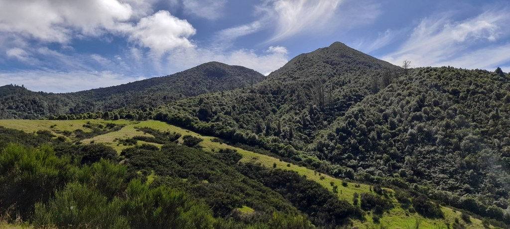
Maybe it’s just me, but I like my maps to have some basis in physical processes, so that I can explain how features formed. This makes the world feel more alive, with a longer history than its inhabitants realise, and it also makes the landscape feel more natural to the audience. We know what a valley should look like. We know how rivers curve, and where lakes can be found. Even for people without a background in geography or geology, we have all seen enough maps to learn which patterns look normal. The physical processes that form landscapes are universal, so unless a fantasy world disavows the laws of physics entirely (no such thing as gravity or thermodynamics), I think it is reasonable for fantasy landscapes to follow the same rules as real ones.
(Now that I’m writing this, I realise I could devote an entire post to fantasy world creation through the lens of Earth science. Look forward to that one!)
In summary…
Maps are great. They convey a lot of spatial information very quickly, letting us see patterns that might otherwise have gone unnoticed. When it comes to fantasy maps, maps let us see the bigger picture, and make a world feel more alive – bigger than just the places visited by the story. They are a staple of the fantasy genre, and rightfully so. That being said, keep a lookout for the map of Highmoor! I’ll probably finish it eventually.
Discover more from C. W. Clayton
Subscribe to get the latest posts sent to your email.
